
A chart is a tool that helps show information in a picture form. It makes numbers and data easier to understand. Charts are useful for showing comparisons, trends, and patterns.
*Download our practice document.
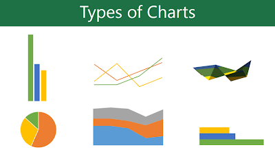
Types of Charts
There are different types of charts. Each type has a unique way of showing data.
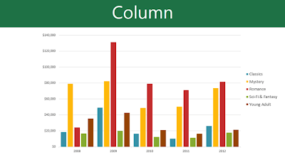
- Column Charts: These use vertical bars to compare information. They are useful for many types of data.
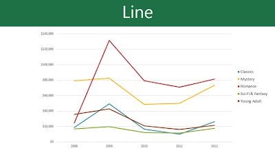
- Line Charts: These show trends over time. The data points are connected with lines.
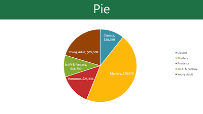
- Pie Charts: These show parts of a whole. Each section represents a percentage of the total.
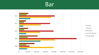
- Bar Charts: These work like column charts, but use horizontal bars instead.
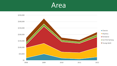
- Area Charts: These look like line charts but have shaded areas under the lines.
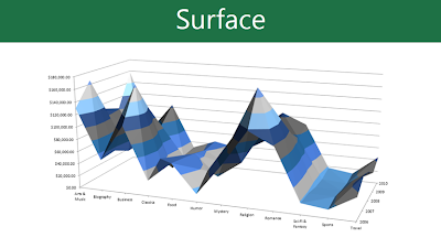
- Surface Charts: These display data in 3D. They work best with large data sets.
Parts of a Chart
Charts have different parts that help explain the data:
- Title: Tells what the chart is about.
- Axes: The horizontal and vertical lines that show values.
- Legend: Explains what the colors or symbols mean.
- Data Labels: Show the exact values of data points.

1. Chart Title
The title should clearly describe what the chart is illustrating.
2. Data Series
The data series consists of the related data points in a chart. In this example, as we can see in the legend, the yellow columns represent net sales in February.
3. Vertical Axis
The vertical axis (also known as the y axis) is the vertical part of the chart. Here, the vertical axis measures the value of the columns. In this example, the measured value is each genre's total sales.
4. Horizontal Axis
The horizontal axis (also known as the x axis) is the horizontal part of the chart. Here, the horizontal axis identifies the categories in the chart. In this example, each genre is placed in its own group.
5. Legend
The legend identifies which data series each color on the chart represents. In this example, the legend identifies the different months in the chart.
How to Insert a Chart in Word
- Click where you want the chart.
- Go to the Insert tab.
- Click Chart in the Illustrations group.
- A box will open. Choose a chart type and click OK.
- A chart and a small spreadsheet will appear.
- Enter your data in the spreadsheet.
- Close the spreadsheet when done. The chart will update.
- The chart will be complete.


Editing Charts
To edit a chart:

- Click on the chart.
- Go to the Design tab.
- Click Edit Data to change numbers.
- Click Change Chart Type to pick a new chart style.
- Click Quick Layout to adjust the chart’s look.
- Use Chart Styles to change colors and design.
Modifying Charts in Word
There are many ways to customize a chart in Word. You can change the chart type, edit data, and adjust its appearance.
Switching Row and Column Data
Sometimes, you may want to change how your data is grouped. For example, a chart may show data by genre with columns for each month. Switching rows and columns can change the grouping to months with columns for each genre. The data stays the same but looks different.
Here’s how to switch rows and columns:
- Select the chart. The Design tab will appear.
- Click Edit Data in the Data group.
- Click the chart again, then click Switch Row/Column.


Now, the data grouping will change.

Changing the Chart Type
If your current chart type does not suit your data, you can change it. For example, switching from a column chart to a line chart may show trends more clearly.
Follow these steps to change the chart type:
- Select the chart. The Design tab will appear.
- Click Change Chart Type.
- Choose a new chart type from the dialog box and click OK.


Your chart will update to the new type.

Changing the Chart Layout
The layout affects elements like the title and data labels. You can select a different layout to organize your chart better.
To change the layout:
- Select the chart. The Design tab will appear.
- Click Quick Layout.
- Choose a layout from the drop-down menu.


Your chart will adjust to the new layout. If needed, you can add extra elements like axis titles and gridlines using Add Chart Element.

To edit a placeholder (like the chart title), click on it and type your text.
Changing the Chart Style
Word provides ready-made styles to change your chart’s color, design, and layout.
To apply a chart style:
- Select the chart. The Design tab will appear.
- Click the More button in the Chart Styles group.
- Choose a style from the drop-down menu.


Your chart will update with the new style.

For quick edits, use the formatting shortcuts next to your chart. These shortcuts help you adjust styles, elements, and filters easily.

No comments:
Post a Comment